They Never Learn
No sooner had the dust sort of settled after the Cracker Barrel logo debacle comes word that another iconic restaurant brand has stumbled into its own identiy problem.
When you think of Long John Silver’s, you immediately think of…seafood. After all, the whole thing is based on a character in the classic book “Treasure Island,” and it’s branding and them supported that.
They also have chicken…which apparently is now going to take center stage.
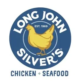
The old logo said Long John Silver’s, with an image of a fish above the wording. Now, the logo has the words “chicken + seafood” at the bottom, and some variations have a chicken instead of a fish in the logo.
Seafood is not even getting top billing anymore.
Now before we get too crazy, this may be a stunt. Recall that not many years ago IHOP…which stood for International House of Pancakes…said it was changing its name to IHOB, which it claimed stood for International House of Burgers, to let us know that while IHOP may have been known for breakfast, their other meals—including burgers—were also tasty.
Is the placement of a chicken in the Long John Silver’s logo nothing more than a stunt so we give them free publicity to remind you that they have chicken as well as fish? Perhaps.
But recall the backlash that IHOP got over its stunt. Recall the backlash that Cracker Barrel is still recovering from.
No, this is not the most important thing in the world right now. But given the level of crazy in the world, we need our trusted brands to be solid. And flipping the script for a seafood restaurant to emphasize chicken is not that.


